| Home | FAQs | Book Contents | Updates & News | Downloads |

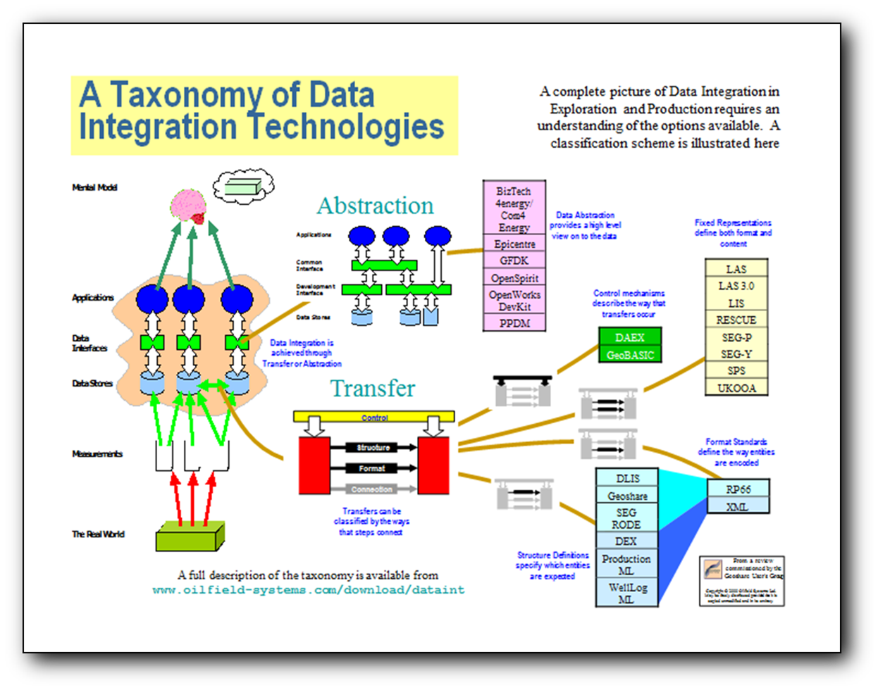
A good PowerPoint presentation can be an effective way to convey information (and a bad one can be an excelent way to confuse, bore and annoy a large number of people en mass). But there's something more satisfying about creating a good poster. Here's an example first laid out in 1999, it summarises a study♣ that compared all the widely used technologies oil companies then employed to integrate E&P data.
I have twice presented detailed studies using only hard copies on a wall. The first time was a deliberate attempt to inject extra interest into a dull topic (presenting data management to senior executives is always a challenge). We ensured that everyone was standing and covered the information by working our way down a picture covered wall. The audience claimed to appreciate the novel approach, true, they ended up not investing, but that was because of other factors (I am sure). The other time we had prepared a presentation and put a poster on the wall, everyone gathered together (the audience turned up late, of course) and on the second slide the projector died, and completely refused to restart, luckily I could cover the topic (at least to the level that the attendant VP wanted) using just the poster.
Good presentations have to each have a "flow", and their nature forces that narrative to be linear (and not too complex). A good poster also has to flow, but its two dimensional nature allows multiple paths, giving the reader a number of potential routes through the information.
It is well known that the "Executive Summary" should be the last thing to write in any report, only once everything else is done can you get the perspective to condense the all the key topics on to a single page. Personally I've found that there are two points during a typical analysis where sketching a potential poster can really contribute. The first occurs after a reasonable amount of data has been gathered, the team meets to discuss the emerging themes, at this point using a whiteboard or flipchart to lay out a poster helps to crystallise some potential paths, components that will later form major sections of the report. The two dimensional form imposes some constraints but it also allows the team to identify the major topics without, yet, placing them in a specific order. To be honest I rarely invest the time to turn that "early form" layout into a printable version, the thinking is usually not mature enough. The phase when most of my best posters have emerged is just after writing the "Executive Summary", brainstorming with the whole team and a large sheet of blank paper to try and pick out the important aspects, when the ideas flow some great images have surfaced.
Next time you are having trouble creating a presentation try sketching out a poster first, it might help to work out what you need to say, and if there is a power-cut it might save you.
♣ The study surveyed the range of approaches used across the industry, it was done for the Geoshare User Group, released in May 2000 and called "Data Integration Technologies in Exploration and Production"
Article 57 |
Articles |
RSS Feed |
Updates |
Intro |
Book Contents |
All Figures |
Refs |
Downloads |
Links |
Purchase |
Contact Us |
Article 59 |